New Museum

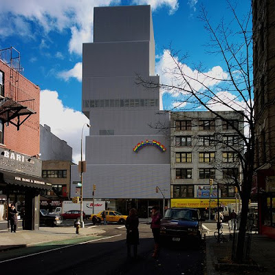
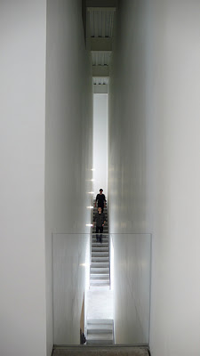
Yesterday before I saw the great one, I went to the New Museum with the sis. I was quite excited because I had seen it before in some architecture publication. The exhibits themselves thougha were lacking. Not only are only three of the floors for art, the pieces they chose weren't so thought-provoking or impressive. What I liked the most about the New Museum I suppose was the building itself. The stairs were on the outer edges of the buildings and were these long dramatic spaces with calculated spots of illumination. Here are some pics:
 I guess it's pretty tricky to capture what it was like to be in that space but believe me it was cool.
 This was one one of the views from the sky room aka the 7th floor.
 Here's another
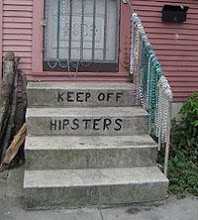
And that's Michel or the clearest pic I could find from yesterday. Bummer but I'll have him in my heart always :D


2 Comments:
"Some architecture publication" - because that's not vague at all.
Can't find many interior shots anywhere - most just look like big empty space (but then, that's usually what you get with a museum). The stair parts you mentioned seem to be the only spatially interesting places to be. But I really can't say, having never been.
Have you seen this? http://www.newmuseum.org/swf/video_player.swf?file=/assets/video/general/august.flv&autoplay=1
I'd be surprised to find pics online of the interior b.c. there is a strict no photography policy but It reminded me a lot of the mattress factory... a bit boxy but weird a lot of wrap around spaces that sometimes come as a surprise. And I know all the exhibitions were modern art but you know a lot about coming to the museum is to be in the building itself... esp when you step into the teeny gift shop area you'll see at least half the walls are dedicated to writings about space or architecture... pretty neato.
btw video is coolio
Post a Comment
Subscribe to Post Comments [Atom]
<< Home